Canadian Coffee Shops - Tim Hortons vs Starbucks
When I visited Calgary, Canada, back in February before the pandemic began, I couldn’t help but notice the sheer presence of Tim Hortons on every corner in the city. That got me wondering: Are there more Tim Hortons than Starbucks locations in Canada?
I’ve had this question for a while now and I finally decided to take a look at the data. Since this topic deals with geographical data, I figured that I would try out R for the first time and play around with this new language.
Shapefile to GeoJSON
Statistics Canada, the national statistics office of Canada, offers digital boundary files for Canadian Census Divisions in the 2016 Census. I converted the Shapefile into a GeoJSON file, which will be needed in order to plot the latitude/longitude coordinates of coffee shop locations.
library(geojsonio)
library(rmapshaper)
library(rgdal)

# This is for generating GeoJSON file for Canada Census Divisions
# Import the shapefile into R as SpatialPolygon Dataframe.
require(rgdal)
canada_division <- readOGR(dsn = path.expand(".../lcsd000a19a_e/"), layer = "lcsd000a19a_e")

library(raster)
s <- shapefile(".../lcsd000a19a_e/lcsd000a19a_e.shp")

# Convert to GeoJSON first in R.
canada_division_json <- geojson_json(s)

# Simplify the polygons to reduce the final output file size.
canada_division_sim <- ms_simplify(canada_division_json)

# Write out the final GeoJSON to the file system.
geojson_write(canada_division_sim, file = ".../canada_division.geojson")
Wrangling the Data
Next, the Shapefile of the Canada Census Divisions is transformed into the Albers Equal Area (AEA) map projection.
After importing the latitude/longitude coordinates for all Tim Hortons and Starbucks locations (data found on POI-Factory), each coordinate is rounded to the nearest 0.25 degrees.
With some SQL formatting, each datapoint plotted on the map reveals whether there are more Tim Hortons or Starbucks locations for that particular 0.25 x 0.25 degree^2 region.
All of these latitiude/longitude coordiantes are converted into coordinates that can be mapped on the AEA projection.
library(ggplot2)
library(rgdal)
library(sp)
library(sqldf)

# Setting parameters for the Albers Equal Area (AEA) map projection
proj <- "+proj=aea +lat_1=29.5 +lat_2=45.5 +lon_0=97.2w"

# Reads the Shapefile and transforms to the AEA map projection
borders <- readOGR(".../lpr_000b16a_e/lpr_000b16a_e.shp")
borders <- spTransform(borders, CRS(proj))

borders.fort <- fortify(borders)
borders.fort


# Reads the Tim Hortons and Starbucks locations
chains <- read.csv(".../combined.csv")

# Rounds each latitude/longitude coordinate to the nearest 0.25 degrees
cellsize <- 0.25
chains$X <- cellsize/2 + cellsize*floor(chains$Longitude/cellsize)
chains$Y <- cellsize/2 + cellsize*floor(chains$Latitude/cellsize)


# Transforms the latitude/longitude coordinates into coordinates for the AEA map projection
coordinates(chains) <- ~ X + Y
proj4string(chains) = CRS("+proj=longlat")
chains <- spTransform(chains, CRS(proj))
chains <- as.data.frame(chains)


# Determines whether a majority of Tim Hortons or Starbucks locations is in a 0.25 x 0.25 region
chaincount <- sqldf("Select MaxCount.X, MaxCount.Y, Min(Counts.Chain) as Chain From
                    (Select X, Y, Max(C) as M FROM
                      (Select X, Y, Chain, Count(Chain) as C from chains GROUP BY X, Y)
                    GROUP BY X, Y) as MaxCount
                  INNER JOIN
                    (Select X, Y, Chain, Count(Chain) as C from chains GROUP BY X, Y) as Counts
                  on MaxCount.M = Counts.C and MaxCount.X = Counts.X and MaxCount.Y = Counts.Y
                  GROUP BY MaxCount.X, MaxCount.Y
                  ")
Data Visualization
Now that the data has been wrangled, it’s time to visualize the data.
Utilizing ggplot2, the background can be set to a default blank canvas, and the built-in geom_polygon and geom_point functions allows for the plotting of the Canada Census Divisions as well as the Tim Hortons and Starbucks locations.
blankbg <-theme(axis.line=element_blank(),axis.text.x=element_blank(),
                axis.text.y=element_blank(),axis.ticks=element_blank(),
                axis.title.x=element_blank(), axis.title.y=element_blank(),
                panel.background=element_blank(),panel.border=element_blank(),panel.grid.major=element_blank(),
                panel.grid.minor=element_blank(),plot.background=element_blank())

plotcolors <- c('Tim Hortons' = '#c8102e',
                'Starbucks' = '#00653d')

ggplot() + coord_equal() + blankbg +
  geom_polygon(data = borders.fort, mapping = aes(long, lat, group = group), fill = NA, color = "#595959", size = .25) +
  geom_point(data = chaincount, aes(x = X, y = Y, color = Chain), size = 0.25) +
  scale_color_manual(values=plotcolors, guide = FALSE)
And finally save the map with the ggsave function.
ggsave(".../canada_coffee_shop_final.png", plot = last_plot(),
       scale = 1, width = 9, height = 7, units = "in",
       dpi = 500)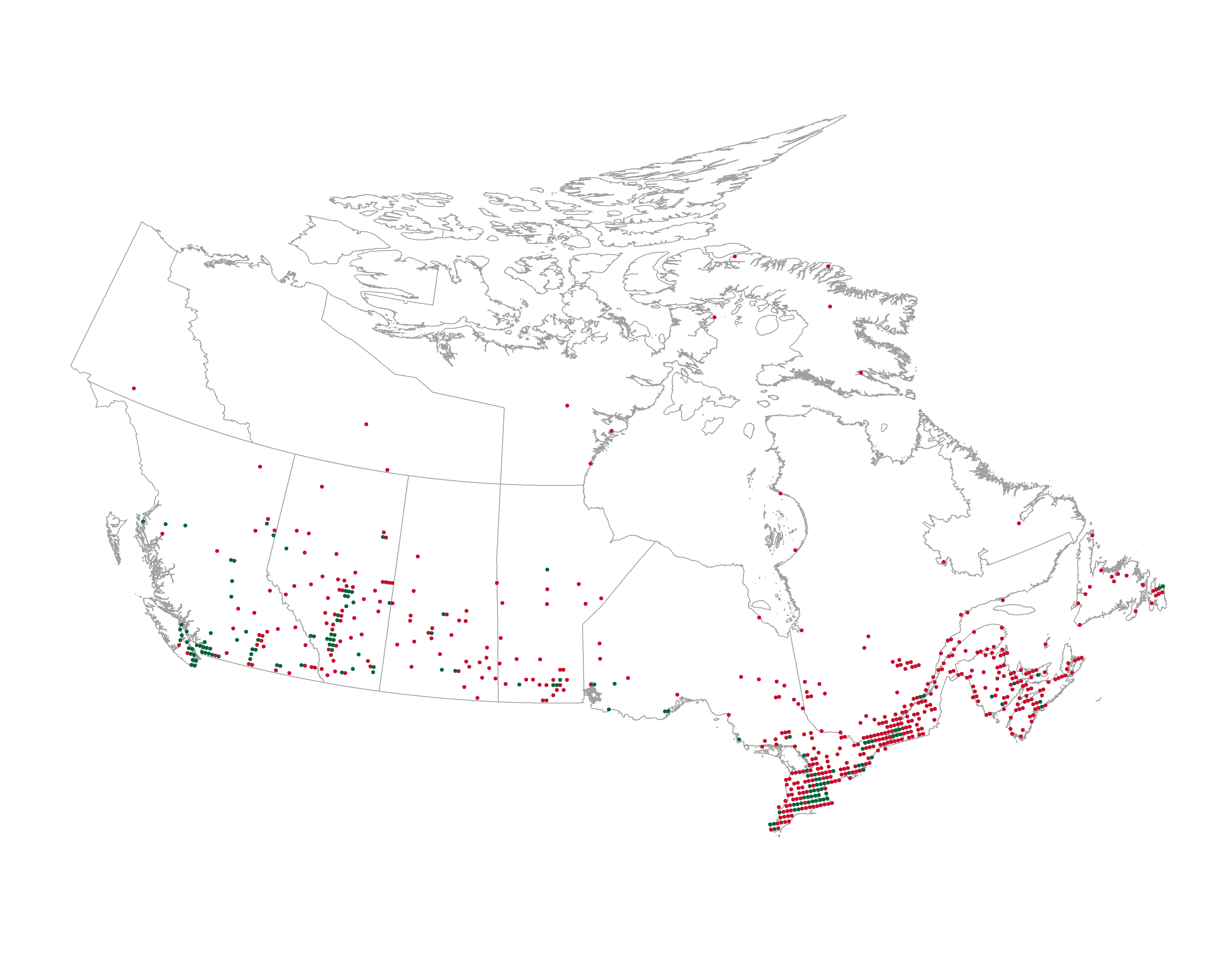
Conclusion
With ~4,200 Tim Hortons locations and ~2,200 Starbucks locations, there’s no surprise that Tim Hortons maintains its presence in Canada. It makes sense that I saw more Tim Hortons that Starbucks in Calgary, Canada.
As seen on the map, Tim Hortons has a larger spread and covers a greater area of the country, extending to more northern regions of Canada than Starbucks. But Starbucks is still relevant as a coffee shop chain in Canada, establishing their presence in urban areas such as Vancouver and Toronto.
To further my project, I plan on webscraping the locations of other Canadian coffee shops. There are some areas with relatively few Tim Hortons or Starbucks locations, and my suspicion is that there are regional coffee shop chains that have been established in those areas.
Thanks for reading!